
Time-saving design tools
Kevin Slimp
Oct 1, 2021


My experience as a professional designer goes back quite a while. I suspect many folks who read my columns were yet to be born when I picked up the box containing Version 1.0 of PageMaker from my desk in Lakeland, Florida, leaving me to wonder what was inside the box. My office adjoined the campus of Florida Southern College, and it seems the Computer Science Department wasn’t sure what to do with this “program” and had it sent to me. I suppose I had a reputation for pushing the limits of those early desktop computers.
I didn’t sleep that night. I carried the box home with me, staying up till morning to figure out how to lay out a page in PageMaker. It was a slow process. At the time, Aldus (the creator of PageMaker) released all its applications first on the PC platform, then Mac. Microsoft Windows wasn’t commercially available at the time, so PageMaker ran on something called “Run-Time Windows,” which was built into the application. To design a letter-size page took approximately eight hours in those early days due to the slowness of those desktop computers. After purchasing my first laser printer, an HP Laserjet, I could print a page in approximately two hours.
Once I learned how to design pages in PageMaker and then learned enough about the Postscript programming language to create vector-based logos and illustrations, I was a hot commodity as a designer. I soon moved on to other applications like QuarkXpress, Illustrator, CorelDraw, Ventura Publisher and Adobe PhotoStyler. Years later, after Adobe purchased Photoshop from Aldus, combining many of the tools from Photoshop with those from PhotoStyler, I learned, then began teaching, Photoshop to audiences that filled auditoriums.
Moving on, I opened an ad agency, which led to my work with Adobe and PDF files. (I was looking for a less expensive way to get proofs to clients.) Before long, I was receiving calls from newspapers internationally for help with design and technology.
Skip ahead a few decades to 2021, and quite surprisingly, I find myself doing more design work than ever. Between book covers, marketing materials and even the occasional newspaper redesign, I generally sit in front of my screen 12 or more hours most days. So, when I find something that saves time in the design process, I’m quick to add it to my toolbox.
I’d like to share two websites that have become daily destinations in my design work in this column. I use both to assist in the selection of colors used when designing book covers and marketing materials. Not only do these tools save time, but they’ve also made the quality of my work increase significantly.
The first is Design Wizard (designwizard.com). The actual URL you will want to visit for selecting color combinations is: https://bit.ly/3lRhbUy
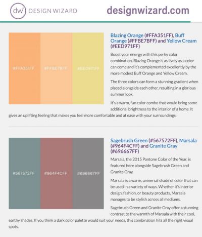
As you scroll down the page of Design Wizard, you’ll find a section titled, “Color Combos That Use Two Colors.” I’ve started using this material in most of my design work. Design Wizard features popular color combinations that work well together. For instance, I would have never thought to use Turquoise and Warm Sand together on a book cover. But with the help of Design Wizard, I did, and the result was a beautiful color combination.
Further down the Design Wizard page, you’ll find a section titled “Color Matching with Three Colors.” If you are like me, you’ll find this information invaluable when designing ads and illustrations.
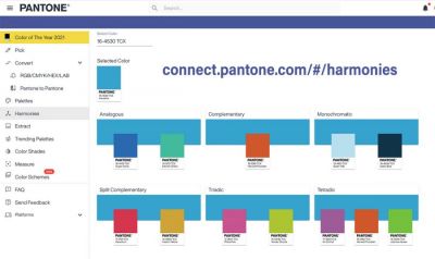
The second website I would recommend is Pantone Harmonies, found at: https://bit.ly/2ZqsJXg
Be sure to enter the URL address precisely that way. Otherwise, it’s tricky to find the right page.
Simply, Pantone Harmonies allows the user to enter a color, then suggests complementary colors.
I’m currently designing covers for 23 books in a series. Each has a similar design but uses its own unique color combination, different from the colors of the other book covers. You might imagine how difficult it was to find 23 different combinations that looked modern and appealing. Pantone Harmonies has been a lifesaver. I simply enter a color. If I enter something generic, like “green,” the website will list all the various Pantone colors in the green family. After selecting the green I want to use, Pantone Harmonies lists color combinations, most of which I would have never imagined on my own.
If you don’t deal with colors or design at your publication, send this column to someone who does. There’s a good chance they will thank you for it later.
Kevin Slimp can be reached at kevin@kevinslimp.com. He leads webinars for newspapers at newspaperacademy.com.